We have always faced many obstacles when it comes to making a UX decision, such as how to determine if there is a specific problem that needs to be fixed, or you want to improve the user experience generally, or a change in the business model inevitably changes some features in the product.
Here comes user experience analytics, simply, it is tracking the users interaction and how are they using the product, then analyzing these results to make decisions based on data.
Heatmaps.
Firstly, what are heat maps? They are thermal visuals that reflect the most places in a single screen in which the user interacts. accordingly, you can control how would u want users to accomplish certain tasks as you want them to do.
I'm not a theoretical guy, so we'll go through a case study that I’ve made to increase logging with social media applications instead of email.
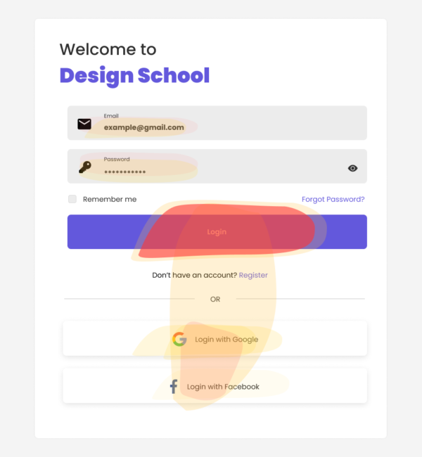
Here we have a login screen with the usual methods of logging in (email and social media) for some reason we decide that we want to make users log in by their social accounts instead of their email so we've run our heat map tool to see how our users have neutrally interacting on the screen. and the results are going to be like this
This screen clearly shows that most of the users are logging in using their email addresses, cause that would be the easier way for them due to where is the CTA located. in addition, colors do have an impact, on this screen, there is more focus that would lead the user unconsciously to use his email instead of his social account. I did some changes according to the analytics which I've got. so I came up with this:
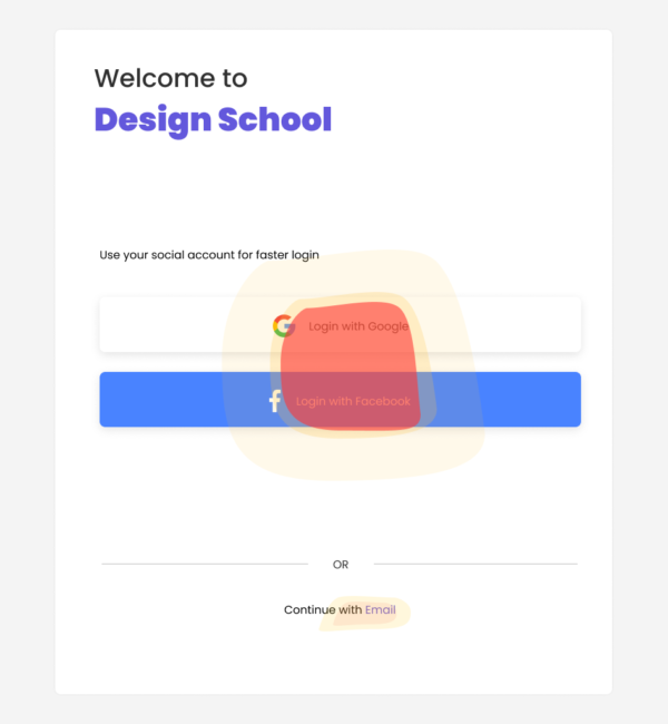
Clearly, based on the data I've got it's now would be more complicated for the user to log in with his email. what I did is I've moved the social login button to the most focused place for the user. and the email option outside the user's range of movement to reduce the possibility of choosing it. so the results would be as:
Thus, we've made an accurate decision without concerns based on realistic data. there is a ton of tools that would help you track such data, choose the one that suits your strategy so you could do your best. Finally, I've tried to make this as short as possible, so don't forget to share this if you like it and I'm open to hearing your thoughts.